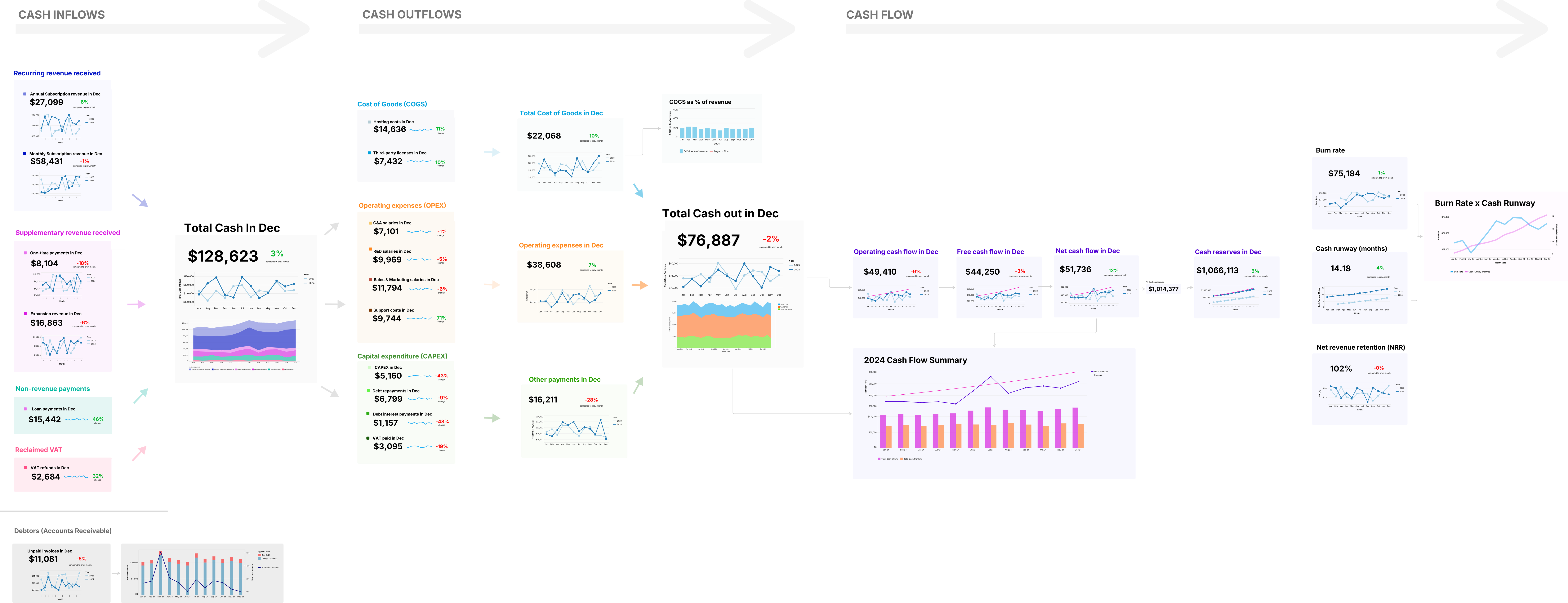
Cash Flow Map
Visualize company finances as a true flow and simplify reporting.
Try this canvas
Problem
Monthly cash ins and outs is currently fragmented across dashboards and spreadsheets with no real sense of how metrics interact.
Solution
Map out monthly cash flow into a stream of metrics that visualizes the relationships between each data point.
Impact
Provides a big-picture view of the company's cash health while making it easy to dive into the details.
You Have Six Months of Runway. Or Is It Eight? Wait, Four?
Your board meeting is in two hours. Someone asks: "What's our current burn rate and how much runway do we have?"
You open QuickBooks. Check last month's expenses. Pull up bank statements. Open that spreadsheet your finance lead maintains. The numbers... don't quite line up.
QuickBooks shows $76K in outflows last month. But that includes a one-time software purchase. And that deferred revenue payment. And wait, did we already pay that vendor invoice or is it still pending?
Your bank balance says one thing. Your accounting software says another. Your runway calculation spreadsheet—last updated three weeks ago—says something else entirely.
Ready to explore this canvas with your own data?
Try this canvas →